KOSTEM Logo Design
KOSTEM stands for Koperasi Sumber Terbuka Malaysia Berhad which will be the first cooperative organization that supports open source movement in Malaysia. This is my first suggestion for KOSTEM logo:
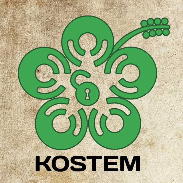
The idea originates from Open Source logo which is green and look like a disc. I'm adding hands to that original open source logo which make it looks like human body with raised hands. The image of human with raised hands means freedom. Then, I align the logo to look like Malaysian official flower, The Hibiscus to put Malaysian sense to the logo. And finally, an open padlock in the middle which means, we are an open community.
If you like it, please vote for it to be the first KOSTEM logo. If you have any other opinions, feel free to leave your comment here.
The idea originates from Open Source logo which is green and look like a disc. I'm adding hands to that original open source logo which make it looks like human body with raised hands. The image of human with raised hands means freedom. Then, I align the logo to look like Malaysian official flower, The Hibiscus to put Malaysian sense to the logo. And finally, an open padlock in the middle which means, we are an open community.
| The original Open Source Logo |
If you like it, please vote for it to be the first KOSTEM logo. If you have any other opinions, feel free to leave your comment here.


Comments